THE STOCK MARKET ROBOT DASHBOARD
Equity Valuation Gauge (or Price / Money ratio)
Risk Level (or volatility)
|
Most investors rely on P/E ratio-based valuation indicators. Most investors underperform the market. Conclusion? The P/E ratio, although popular, intuitive and easy to use is not particularly useful.
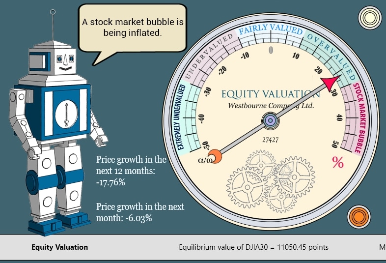
Earnings-based valuation measures have failed most investors since 2007. Trailing P/E signalled that the stock market was very expensive in Q1 2009. In fact, stocks were amazingly cheap then. Forward earnings estimates are notoriously unreliable and mostly corrected downwards. The consensus of the analysts will betray you most bitterly when you need it most urgently. What about CAPE (Cyclically Adjusted P/E) or Shiller’s P/E, which is supposed to smooth out short-term fluctuations in earnings data? Investors who followed CAPE are more likely to have underperformed than outperformed the market between 2009 and 2016. Why? CAPE methodology is systematically biased as it is based on flawed methodology. Consumer prices and asset prices are not completely connected. Asset prices are not incorporated into the consumer price basket, which is why asset prices or earnings should never be discounted by consumer price inflation: doing so inevitably leads to distorted results. In the particular case of CAPE, this supposedly neutral indicator provided values that have been systematically biased upwards (giving higher P/E ratios than expected). CAPE has for many years, therefore, consistently provided wrong “sell” signals. The Equity Valuation Gauge is based on the Price/Money ratio. As money supply in the economy grows, so do prices. The Quantitative Theory of Money explains the relationship between money supply and consumer price inflation. The Price/Money model used here is based on similar logic. It can be shown that asset prices (including major stock benchmarks) follow the growth of money over the long term. In the short to medium term, stocks may be undervalued or overvalued relative to the money supply. Unlike earnings, money supply is a very robust measure with few fluctuations. This is particularly helpful under extreme conditions, such as a financial crisis or a rapid post-crisis recovery. (Remember, P/E fails miserably under such conditions.) It is important to note that stocks can often continue to grow if overvalued, or fall when undervalued. The Equity Valuation Gauge value should not, therefore, be interpreted as a buy or sell signal per se. Other indicators are required in order to obtain the whole picture. |
The Equity Gauge on 18. July 2007
The Equity Gauge on 17. July 2009 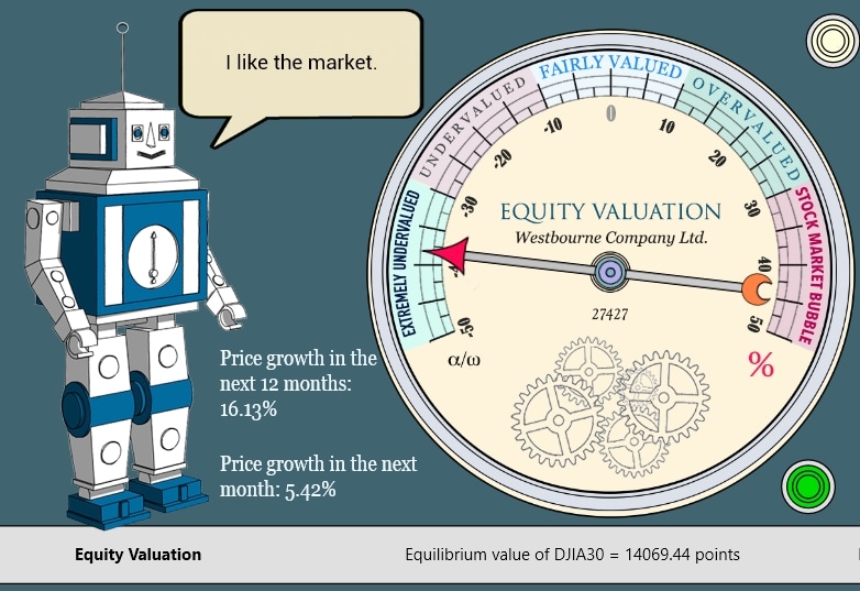
|
Profitability (or Profit/Money ratio)
|
Risk Level is a measure of stock market volatility as expressed by the VIX index. This index is published daily by the Chicago Board Options Exchange (CBOE). Although it is based on a somewhat sophisticated set of calculations, understanding it is quite straightforward: the higher the number, the higher the perceived risk.
There is a snag, however. If Risk Level is very low, it is reasonable to expect that it will grow sooner or later. In other words, a low figure may signal the quiet before the storm. When the storm finally hits and stock prices fall in panic, Risk Level rapidly increases. When it reaches panic levels (over 30 or 40), it may be reasonable to expect it to fall, which usually means that stock prices find a level of stability and resume an upward trend. When Risk Level falls from high levels, this is usually a favourable time to buy stocks. There are some caveats, of course: as the indicator merely displays the market perception of risk on a given day, not the true risk of the stock market itself, the Risk Level indicator should not be used as the only gauge for when to buy or sell stocks. |
Risk Level on 20. February 2007
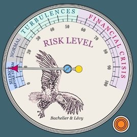
Yes, that was a textbook case of silence before the storm.
Risk Level on 20. November 2008
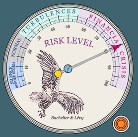
Buy on panic... If you dare, that's it.
|
|
In the long run, corporate profits grow at the same average pace as the money supply. The more money in the economy, the higher the profits. This is not really surprising.
In the short to medium term, corporate profit growth may substantially deviate from the average. During an expansion, profits grow much faster than the economy. During a recession, however, profits may fall well below the level that we might call an 'equilibrium'. When the recession ends, profits return to the mean level. Note that you will not find this relationship in any textbook: the relationship between corporate profits and money supply has remained completely outside the interest of academia (as has the relationship between stock prices and money supply). The Profitability gauge shows how corporate profits are deviating from their long-term trend. If corporate profits are, say, 30 per cent below the trend, then they will probably return to the mean sooner or later. Likewise, if profits rise too high, profit growth is unlikely to remain sustainable, leaving plenty of room for disappointment among investors somewhere down the road. Because the relationship between money supply, stock prices and corporate profits is largely ignored by the mainstream financial world, understanding it becomes very valuable, but such an understanding is virtually unknown among financial professionals. Anyone with an MBA or CFA, even the most junior analyst, knows numerous ratios – P/E, P/B, P/Sales, P/CashFlow, and so on. But Profit/Money (P/M) ratios provide information that is robust and rather unique. |
Profit/Money Ratio on 1. December 2006
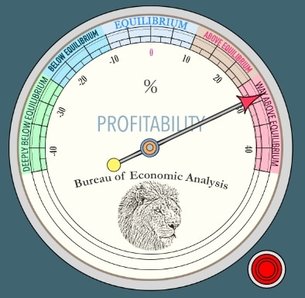
A good news? High profits tend to revert to the mean trend, whereby creating a potential for future disappointment...
Profit/Money Ratio on 27. February 2009
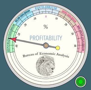
... while depressed earnings have silver lining: the chance of returning back up to the trend level. Hence the green alert in the post-crisis market of February 2009.
|
The Bank-O-Meter (or commercial banking activity indicator)
|
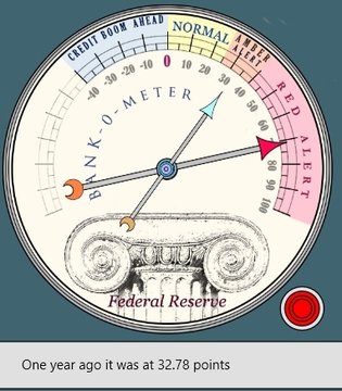
Unlike previous gauges, the Bank-O-Meter is actually a composite of two sub-indicators:
The Bank-O-Meter should be read as follows:
|
On 29. February 2008: Overheated
On 24. March 2009: Still overheated, but with a falling trend. A crucial difference!
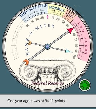
The trend change makes the difference between the red and the green alert. While most macro figures look awful, the economy is already on the mend.
|
The Monetary Thermometer (or monetary inflation indicator)
Yield Curve Spread (THE early-warning recession indicator)
|
In the old days of the gold standard, there was no Consumer Price Index. Inflation, however, was well known, although it meant something different then. It used to denote the growth of the money supply in the economy. Inflation as we know it today (Consumer Price Inflation) was introduced only during the 1930's.
Although overlooked by analysts and academia, monetary inflation has never lost its meaning and provides information on the speed of growth of liquid money in the economy. Why is it useful?
Keeping track of monetary inflation is thus very useful for equity investors and economists. Oddly enough, this indicator tends to be overlooked by the mainstream. Inflation has become synonymous with the CPI, but monetary inflation has never lost its importance. |
On 28. June 1999: Overheated
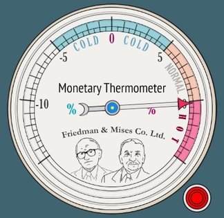
When it comes to the detection of overheated markets, few indicators are better than monetary inflation.
On 4. October 2007: Once again overheated
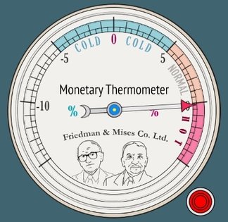
|
|
The yield curve tells us the yield on bonds with varying times to maturity. In this particular case, the yield spread is simply the difference between the yield on 10-year US Federal bonds and that on 2-year US Federal bonds.
The yield on long-term bonds is usually greater than that on short-term bonds. This is the natural state of affairs, since long-term bonds are more risky. On rare occasions, however, short-term bonds may show higher yields. In such cases, we speak about an inverted yield curve. When a situation like this takes place, an economic recession is highly likely to occur as soon as the yield curve spread starts to rise again. This has worked very well as a recession indicator in the US economy, at least during the post-war period. Since 1960, an inverted yield curve – where short-term rates are higher than long-term rates – has preceded all recessions. There was only one false alarm, in 1965. Why does an inverted yield curve have such an uncanny ability to forecast a recession? The yield curve reflects changes in market expectations of future short-term interest rates. A steepening yield curve – that is, one with an increasing spread between long- and short-term rates – usually implies an expectation of higher short-term rates in the future. A flattening curve, on the other hand, implies an expectation of falling short-term rates. Market expectations of future interest rates, in turn, reflect expectations of future real economic activity and monetary policy. During a recession, short-term rates fall as the demand for credit weakens and the Fed eases monetary policy. If investors anticipate a recession, they will expect short-term rates to tumble. This expectation can then translate into an inverted yield curve. In other words, the yield curve reflects the collective expectations of the market, which is rarely wrong. The simple spread between long- and short-term interest rates has generally outperformed most forecasting tools as well as most economists in the commercial world and in academia. |
On 8. December 2006
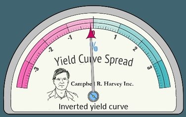
The US Federal Bonds yield spread went negative during the Winter of 2006/2007. Recession started only in December 2007 when the spread crossed the value of +0.5 p.c.
On 8. November 2007
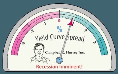
As to forecasting recessions, the Yield Curve Spread tool is second to none.
|